
Every Winning and Losing Month
What a decade of monthly returns reveals about the Retirement Portfolio

Most investment charts hide the journey. An equity curve compresses years of decisions, dull months and uncomfortable setbacks into one rising line. It tells us where the portfolio finished, but not what it felt like to own along the way.
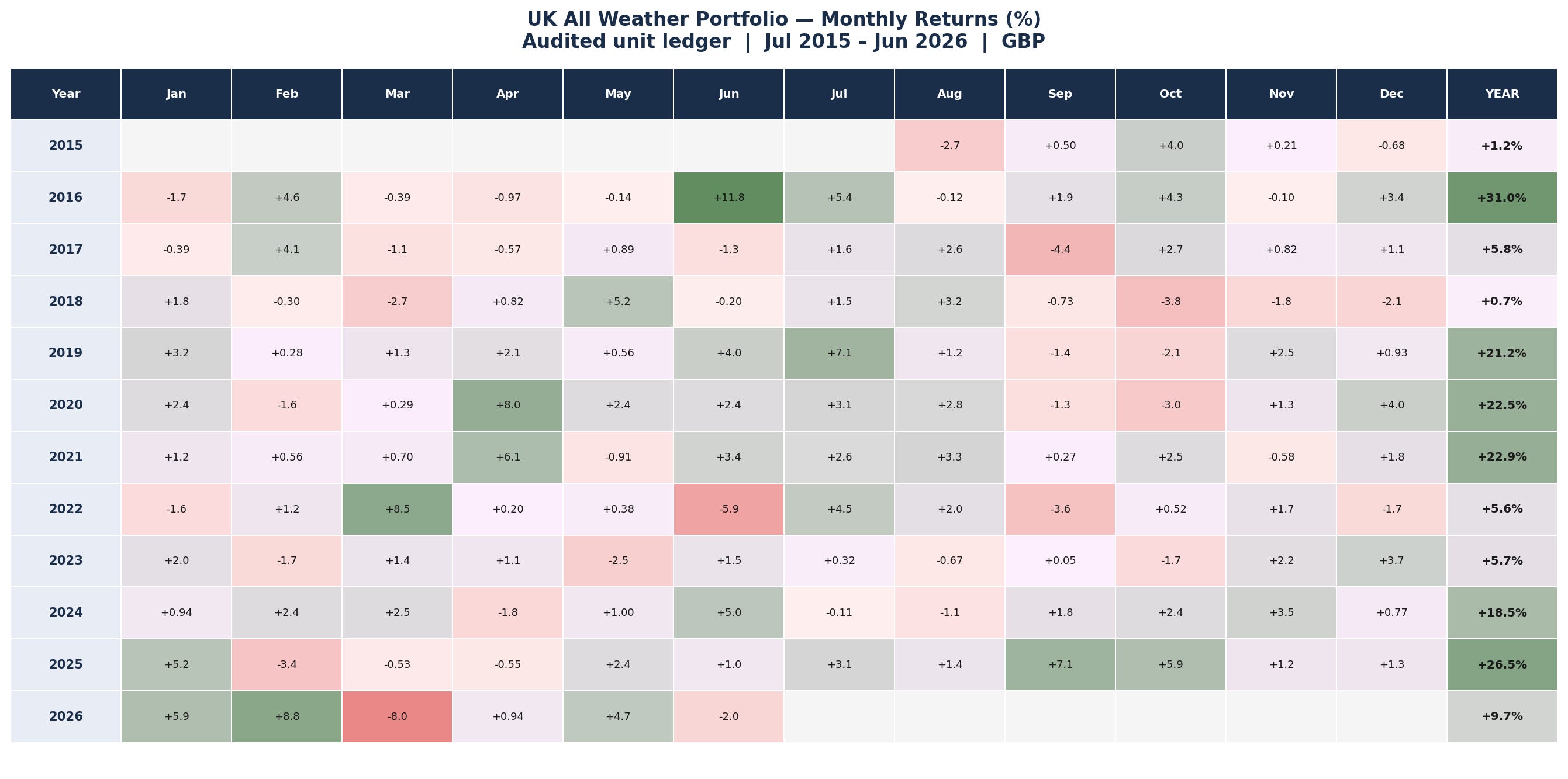
The heatmaps in this report show every completed month in the frozen UK All Retirement Portfolio backtest, from July 2015 to June 2026. Green cells are gains. Red cells are losses. The numbers are the actual monthly returns generated by the production backtest, with no smoothing and no retrospective changes to the strategy.
The monthly record
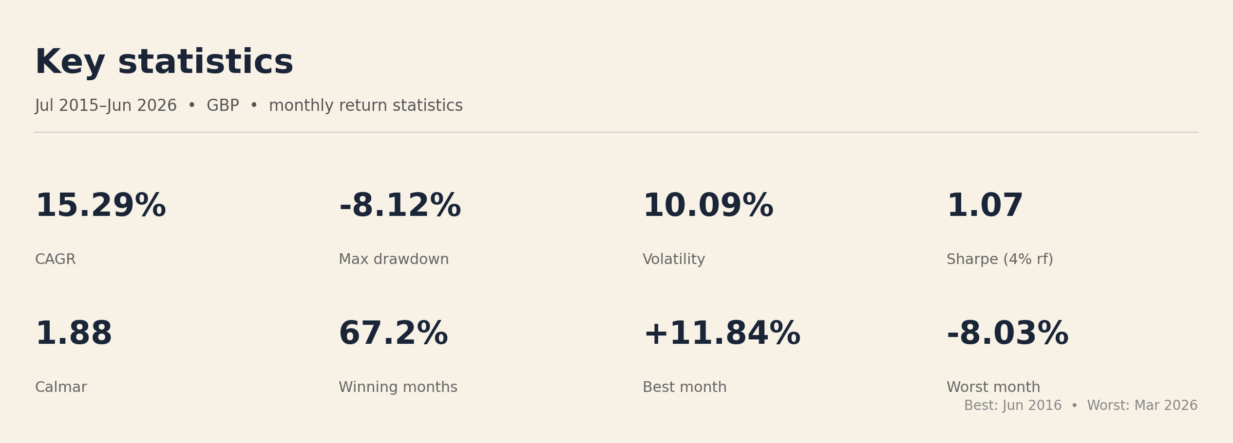
Across 131 completed months, the portfolio recorded 88 gains and 43 losses. That is a monthly win rate of 67.2%. The best month was June 2016, when the portfolio gained 11.84%. The worst was March 2026, when it lost 8.03%.
Those figures are a useful antidote to the idea that a successful system should win almost all the time. It should not. A robust portfolio is paid for accepting uncertainty, and uncertainty arrives one month at a time. Losing months are not necessarily signs that the process has stopped working. They are part of the distribution that produces the long-run result.
The asymmetry matters more than the raw count. A strategy can be right less often than expected and still compound well if it participates in sustained advances while containing the damage in adverse regimes. Over this test, the portfolio compounded at 15.29% a year with annualised volatility of 10.09%. Its deepest monthly drawdown was -8.12%, measured at month-end closes.
Why not simply buy SPY?
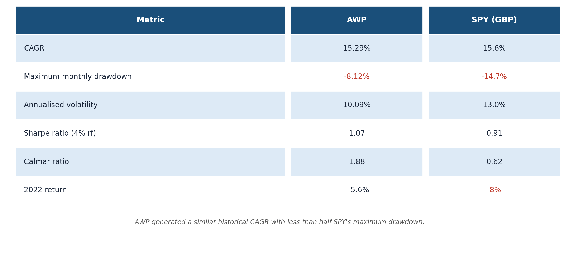
The answer is not higher returns in every month. Over this backtest, RP and SPY produced similar annualised returns in pounds: 15.29% versus 15.6%. But RP’s maximum monthly drawdown was 8.12%, compared with 14.7% for SPY. Its Calmar ratio was 1.88, compared with 0.60 for SPY — more than three times higher. Historically, the portfolio surrendered some upside during strong equity months in exchange for materially shallower losses when markets became hostile. For an investor withdrawing from a portfolio, that difference in the path can matter as much as the final return.
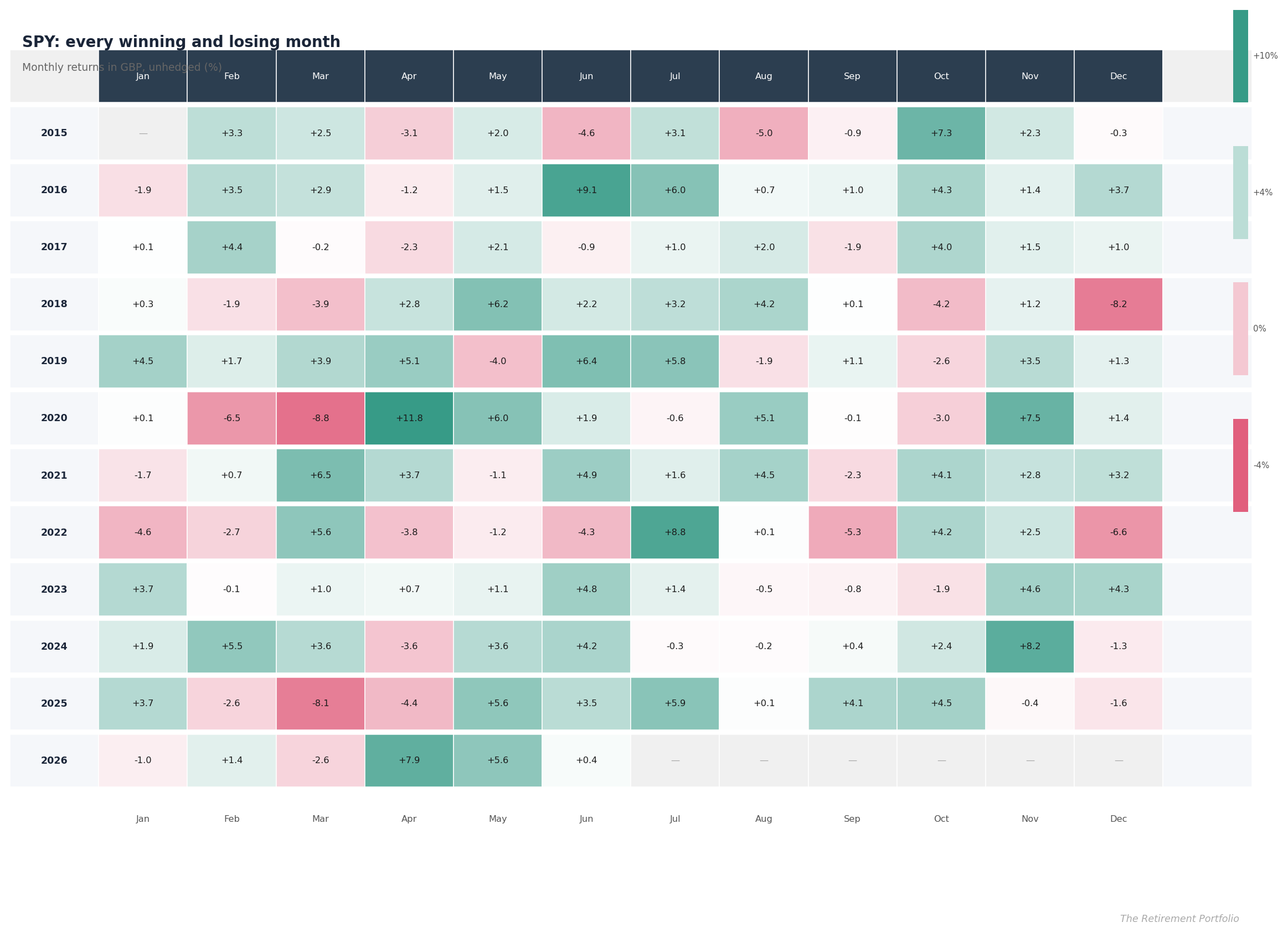
The second heatmap shows SPY converted into pounds, so the comparison reflects the experience of a UK investor holding an unhedged US equity fund. The third subtracts SPY’s monthly return from the portfolio’s return. Green in that relative map does not necessarily mean the portfolio made money; it means it did better than SPY that month. Red means it lagged.
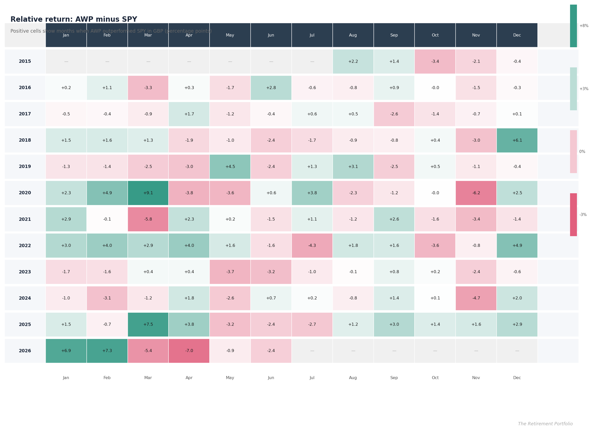
Over the 131 directly comparable months, the Retirement Portfolio outperformed SPY in 59, or 45.0%. This is not meant to prove that one should beat the other every month. Their jobs are different. SPY is a concentrated claim on large US companies, with sterling currency exposure layered on top. The Retirement Portfolio rotates across attack and defensive assets and is explicitly designed around drawdown control.
That difference becomes most valuable when the equity market’s return distribution turns hostile. In strong, persistent US bull markets, diversification can look unnecessary. During shocks and reversals, the ability to hold assets with different economic sensitivities becomes visible. The relative-return heatmap makes both sides honest: protection has value, and so does the opportunity cost paid when SPY races ahead.
Twelve months changes the picture
Individual months contain a great deal of noise. The rolling 12-month chart asks a better behavioural question: what return would an investor have seen over the preceding year at each point in the test?
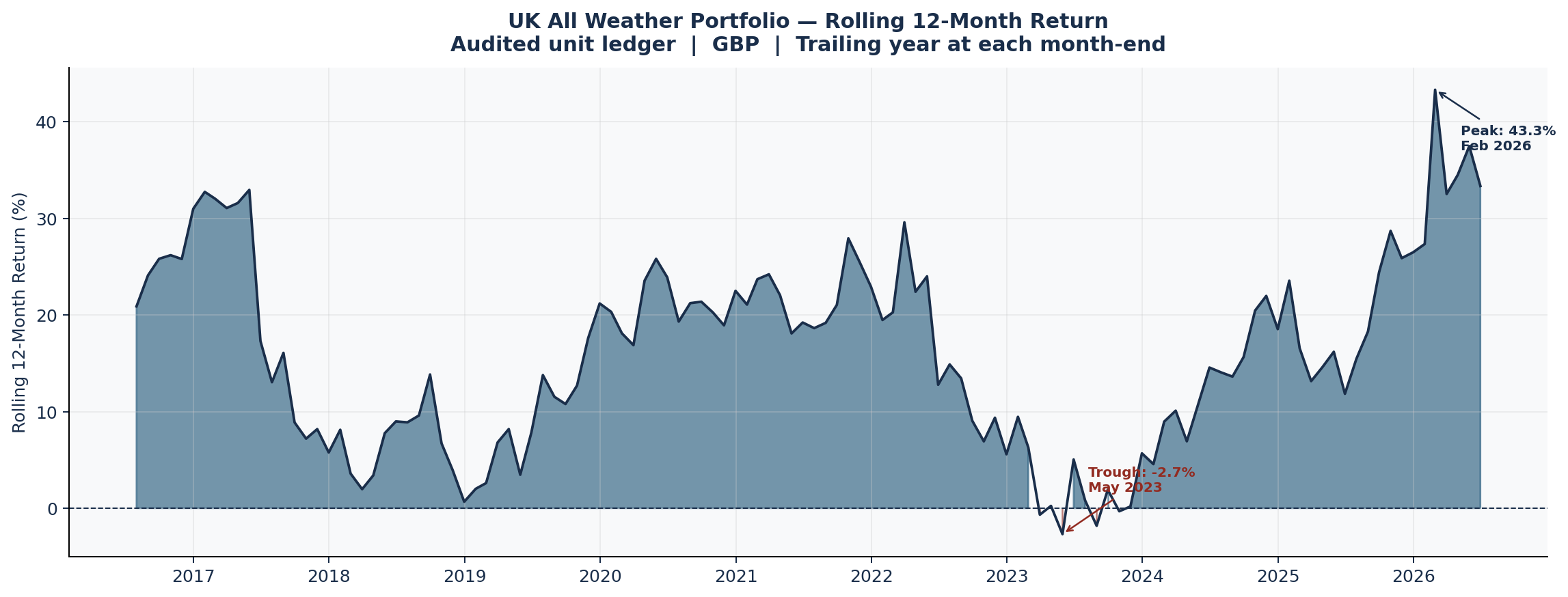
The strongest 12-month stretch ended in February 2026 at 43.31%. The weakest ended in May 2023 at -2.69%. These rolling figures overlap, so they are not independent observations, but they reveal whether results came from one isolated burst or from repeated compounding across different environments.
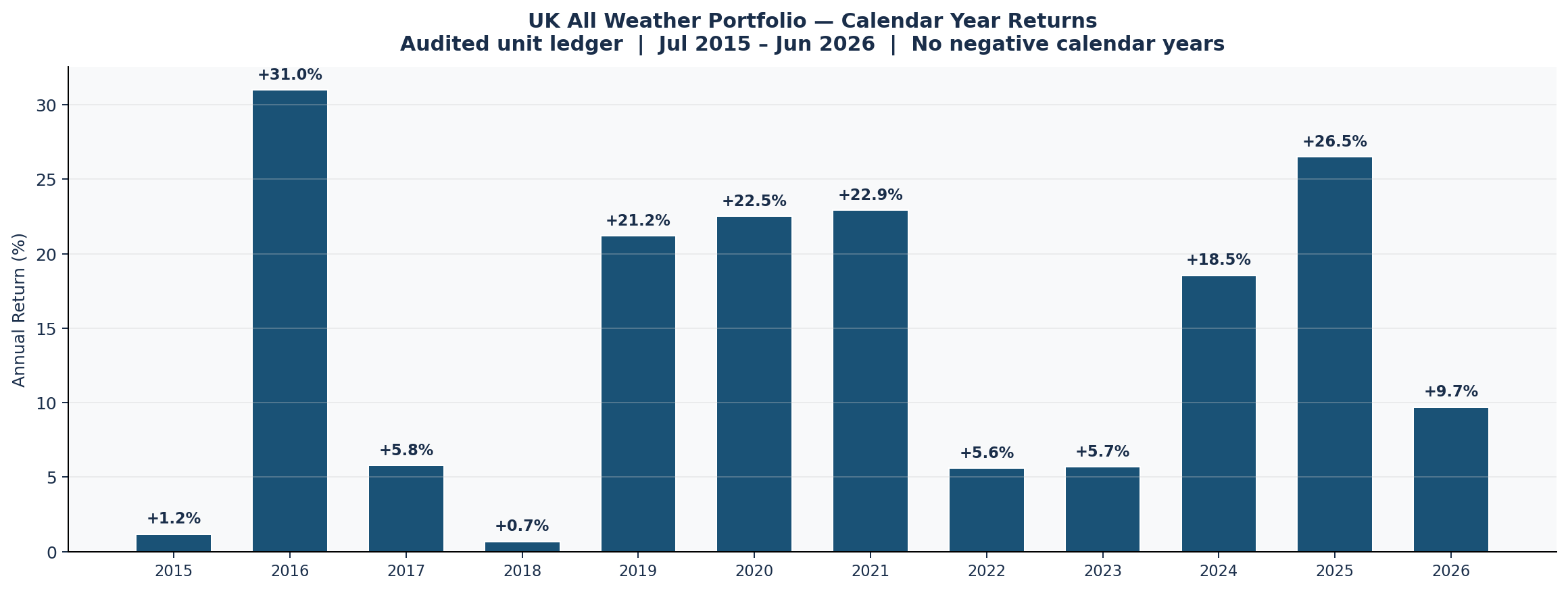
The annual chart provides a second view. Calendar years are arbitrary cut-offs, yet they are how most investors review statements and judge themselves. There were no negative calendar years in the available record. A positive long-run CAGR never promises a positive return in each calendar year—or even in every rolling year.
What the losing periods actually looked like
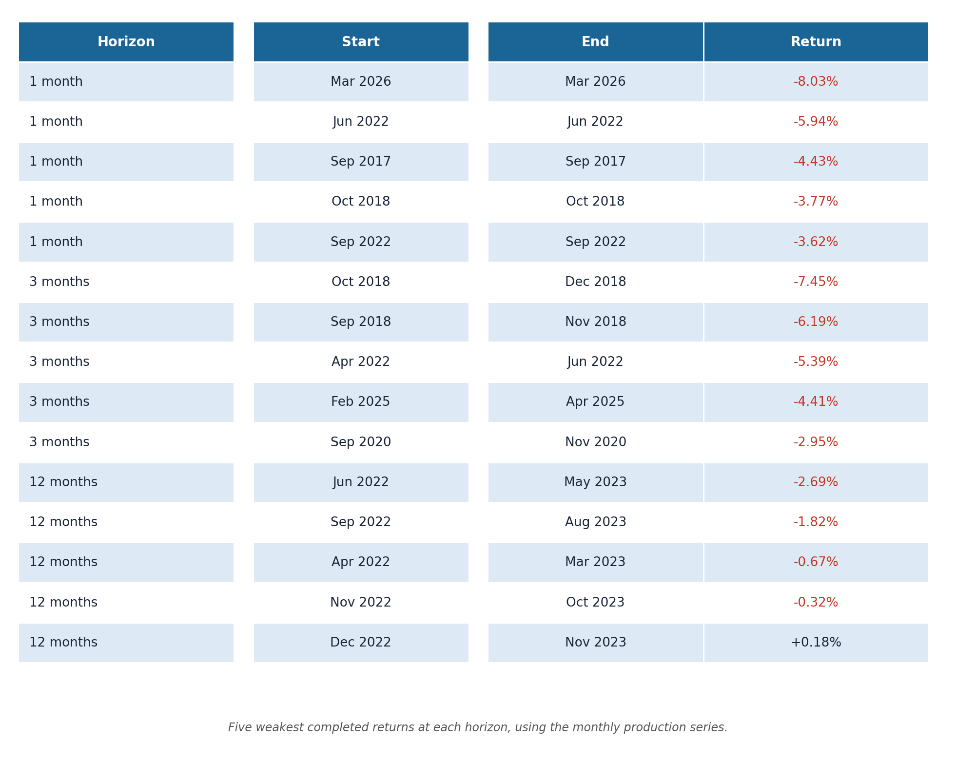
The table ranks the weakest one-, three- and 12-month outcomes. The single worst three-month stretch ended in December 2018, with a return of -7.45%. The drawdown table tracks each underwater episode from the prior peak through the trough and eventual recovery.
This distinction matters. A bad calendar month is a fixed slice of time. A drawdown is an investor experience. It begins when capital falls below its previous high and ends only when that high is recovered. Several modest negative months can therefore create a longer psychological burden than one sharp fall followed by a quick rebound.
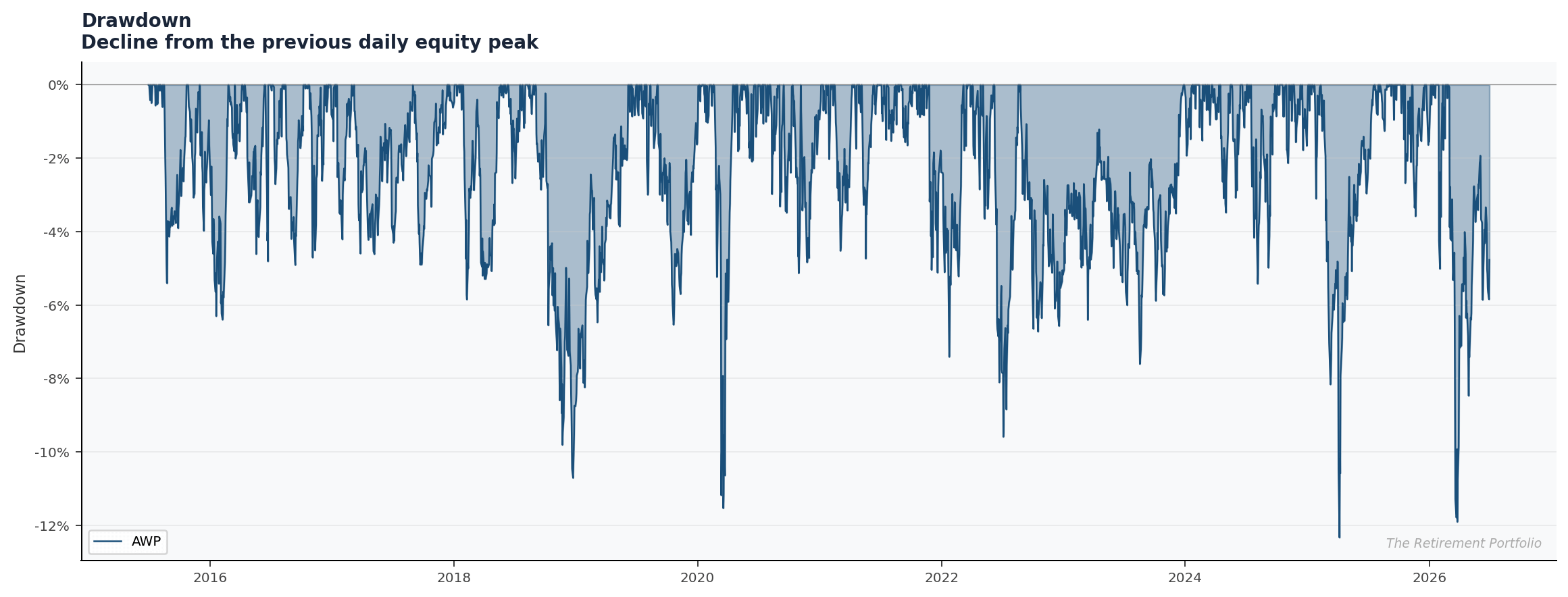
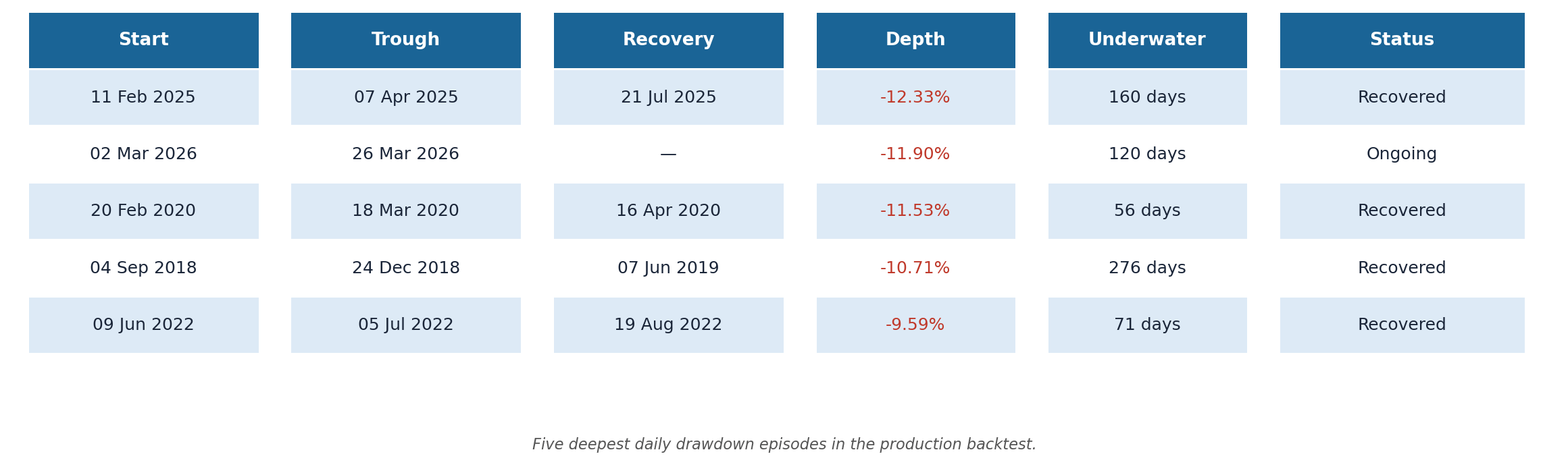
The current episode is correctly marked as ongoing. The portfolio’s previous daily equity peak was 27 February 2026 and its worst point in this episode was 11.90% below that peak on 26 March. By the end of June 2026 it remained approximately 5.46% below the peak, but had not yet established a new high. The -11.90% shown in the table is therefore the episode’s maximum depth so far, not its current drawdown.
Drawdown control is not the same as drawdown elimination. The portfolio’s Calmar ratio was 1.24, calculated as CAGR divided by the magnitude of the maximum daily drawdown. That number summarises an attractive historical trade-off, but it does not place a ceiling under future losses. Markets can always produce a regime absent from a backtest.
How to read this report
I would not use the heatmap to hunt for seasonal rules, nor treat a particular month as inherently favourable or dangerous. With a little more than a decade of data, each calendar month has only a small sample. Apparent patterns can easily be coincidence.
The more defensible lessons are behavioural. First, winning systems still lose regularly. Second, the path of relative performance can be uncomfortable even when the long-run result is good. Third, looking at daily drawdowns alongside monthly returns prevents a month-end report from understating the worst experience. Finally, a systematic investor needs to decide in advance which evidence would justify changing a model. Disappointment over a few red cells is not enough.
This is why I publish every winning and losing month. A polished equity curve can encourage false confidence. The complete return grid shows the bargain more clearly: irregular gains, unavoidable setbacks, periods of lagging the obvious benchmark, and the possibility of strong compounding when the rules are followed consistently.
There is also a practical reason to keep this record. Memory is selective. After a strong run, earlier losses tend to look smaller and more obviously temporary than they felt at the time. During a setback, previous recoveries can seem irrelevant. A fixed monthly record prevents both distortions. It gives the investor a contemporaneous baseline against which to judge whether present results remain within the broad historical character of the system—without pretending that history defines every possible future outcome.
Backtested results are hypothetical, exclude personal tax circumstances and are not a guarantee of future performance. This article is for information only and is not financial advice.